Every business wants to have impressive sales, but getting them can sometimes be tricky. Many factors contribute to more sales. For instance, it could be harder to convince others to buy from you if you don’t have good marketing or customer service.
One of the best-known ways to convert more sales is to advertise your products and services. But an often overlooked method is your store’s design. Surprisingly, this can play a major role in whether you catch a customer’s attention.
Figuring out the right store design though can be overwhelming. This is especially so if you don’t know where to start. How do you know whether a placement is right? Is your retail strategy effective? There are so many small yet critical details that you need to pay attention to.
If you’re interested in learning about some of the top store designs to convert more sales, check out these tips.

8 Store Designs to Convert More Sales
1. Create a Strong Retail Strategy
If you don’t have a good retail strategy, you won’t have many sales. A retail strategy is meant to help you plan and implement methods that help you stand out from your competition.
To begin with, consider what your mission is. This includes the company’s values, your overall products, and why you want to offer your services to others.
You’ll then want to determine your target audience. Consider the type of merchandise or services you’re selling and who it might be best for. If you’re a music store, think about whether there are certain genres you want to emphasize and what target audience tends to like them. You can then use this knowledge to reach out to them better. Knowing your target audience will also help you find the right business location if you want a physical store.
Other aspects to include in your retail strategy are:
- Thinking of shopping benefits (why someone should stop by your store),
- Building a good marketing budget,
- If you should do brand partnerships,
- Potential promotions.
2. Invest in Professional Images and Videos
High-definition media can quickly catch customers’ attention. Whether it’s a vibrant photo or a captivating product video, it gives you a few seconds to convince them to buy the item.
This is especially important if you have an online shop. Good photos are critical for online sales. Blurry or small ones won’t show the full details of the products.
Keep in mind that the images shouldn’t just be straight on. Instead, have different angles of the product. These 360° rotation photos are an excellent way for customers to interact virtually with an item.
For videos, try cinemagraphs. They’re like GIFs, but are only a second-long. They’re interactive in a unique way and can show off hidden details.
If you do decide to go this route, consider using the services of local photographers and videographers. This way, you can support local businesses while building a potentially beneficial relationship for the future.
3. Watch the Layout
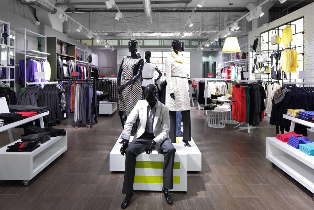
Another thing to review is your store’s layout. This determines how well people can move around inside and if merchandise is being properly seen.
Observing regular store traffic is a good option for finding the right layout<strong”>. For instance, do people tend to flock one way over the other? Are certain aisles more difficult to reach? Studying this can help you determine the right way to place items to encourage more sales and shopping time in your store.
If you’re unsure whether a certain layout will work, test it out. Monitor how things go over a specific time. If you notice problems, you can easily change it up again.
4. Put Things by the Checkout
Many times, situating shelves or baskets with trinkets and similar items can encourage customers to buy them if they’re standing in line for a bit. Known as point-of-purchase, this process strategically places certain goods near the checkout that might otherwise be overlooked. Be sure to understand your customer’s overall needs so you can pick what goods are best to put here.
You can also do this virtually. Before someone checks out, have similar items near their cart and point to them before they officially pay for things. This can turn their attention to products they might not have seen but would be interested in purchasing.

5. Watch Your Entry Placement
While placing items by the checkout can be good, the store’s entry is a different story. Customers don’t want to be bombarded with shelves everywhere when they enter. This can make your store look very cluttered and disorganized. It could even overwhelm them and turn them away.
Items can still be placed by the entrance, but carefully think about what they should be. Make sure that they’re also displayed in such a way that catches one’s attention.
6. Offer Free Shipping
Shipping can be a major factor in whether someone decides to buy from your online shop. Sometimes, it can even cost more than the total items they buy.
Free shipping oddly can incentivize people to buy from you. It might even encourage them to purchase more. You can often work the free shipping into product prices. In most cases, increase the free shipping range by 10-15%. So, if customers have a cart worth $50, they can get free shipping by purchasing up to $55-$60 in goods.
If you cannot offer free shipping, see if you can have a flat fee. This will be the overall shipping cost regardless of how much one buys.
7. Have Multiple Checkout Options
Another design aspect of brainstorming for your store is checkout options. While having one or two checkout centers might save you money, it might irritate customers. It can be especially troublesome during busy days and could cause them to leave without buying.
To prevent this, use an innovative approach to checkouts. While you can still have employees check people out, and also have self-checkout options. This keeps things moving and can motivate more sales.
8. Create an Experience
Many shoppers enjoy being in an immersive atmosphere. It not only makes them feel more positive, but can inspire them. This could inspire them to buy more than they planned.
It’s important to produce a vibe that fits your store’s theme. So, if you have a candle shop, make it cozy and fragrant. Doing this shows effort and that you’re trying to cater to the customer – something many appreciate.
Designing your store in a specific way can be a great way to convert more sales. By keeping these tips in mind, you can get a better idea of how you should plan yours.
For more information, please refer to the following pages:
- What Are the Elements of Retail Strategy?
- What Is the Most Powerful Marketing Strategy in Retail?
- Top Problems You Might Have With Retail Strategy
- How to Attract Customers Who Will Pay Full Price for Your Products
- Tips for Streamlining Your Sales Process in Retail
- Retail: Top Reasons Your Customers Are Going Elsewhere & What to Do About It
